Have you ever encountered this problem at the store???
- The menu has delicious flavors and is not expensive. Plus, the location is good. But why aren’t customers coming into the shop?
- Delivery service is available, but customers have not yet placed an order.
- Using quality raw materials imported from the source, but sales did not increase.
One thing that many people may forget to think about is the restaurant’s menu or the pictures we use to make the menu or post on social media. It is like the first window of every restaurant, affecting the customers’ purchasing decisions. Let’s see what kind of menu book design can attract more customers.
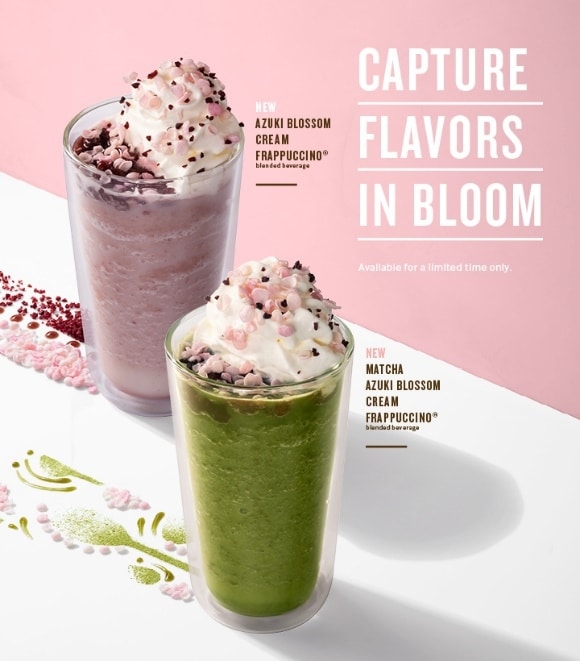
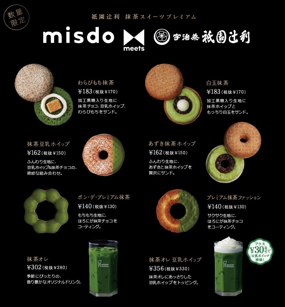
1. The words used in the menu must be exciting, such as “Handcrafted,” “Recommended,” “New Arrival,” “Signature Menu.” However, do not use too many because customers may be confused in deciding what to order. For example, in this picture, if you look at it superficially, many people may not be interested. However, if you look closely and see the word NEW in the picture, it will catch your eye and make you want to buy it immediately.
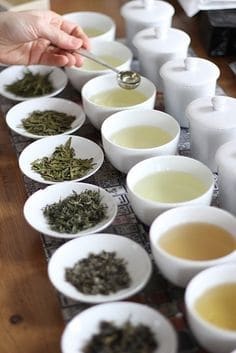
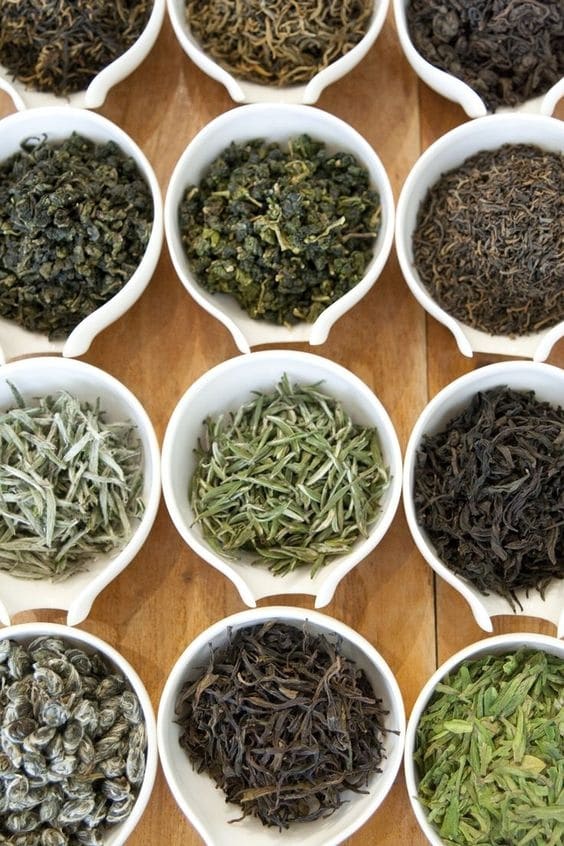
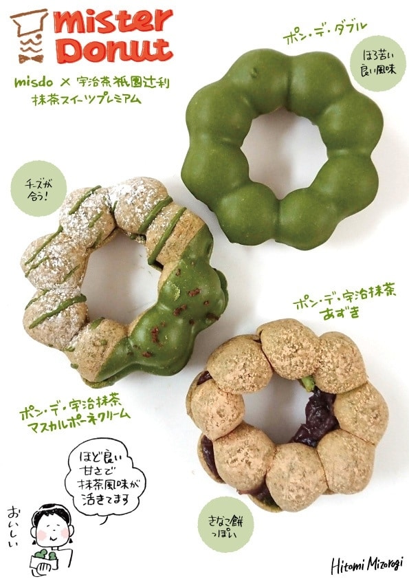
2. Tell the story of that menu. Describe the taste of the dessert, what are the ingredients of the filling, or briefly explain the ingredients. Which menu uses premium ingredients, such as green tea powder imported from Uji Kyoto, a fine tea of Japan? These words help stimulate customers’ interest because they know the origin of the delicious ingredients, which helps them want to order food a lot.
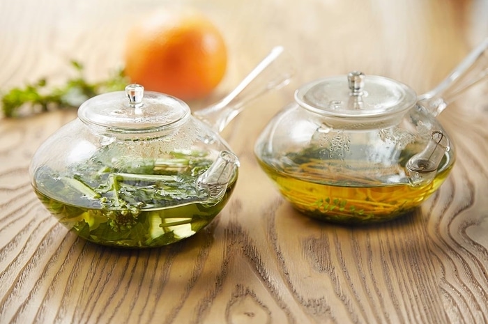
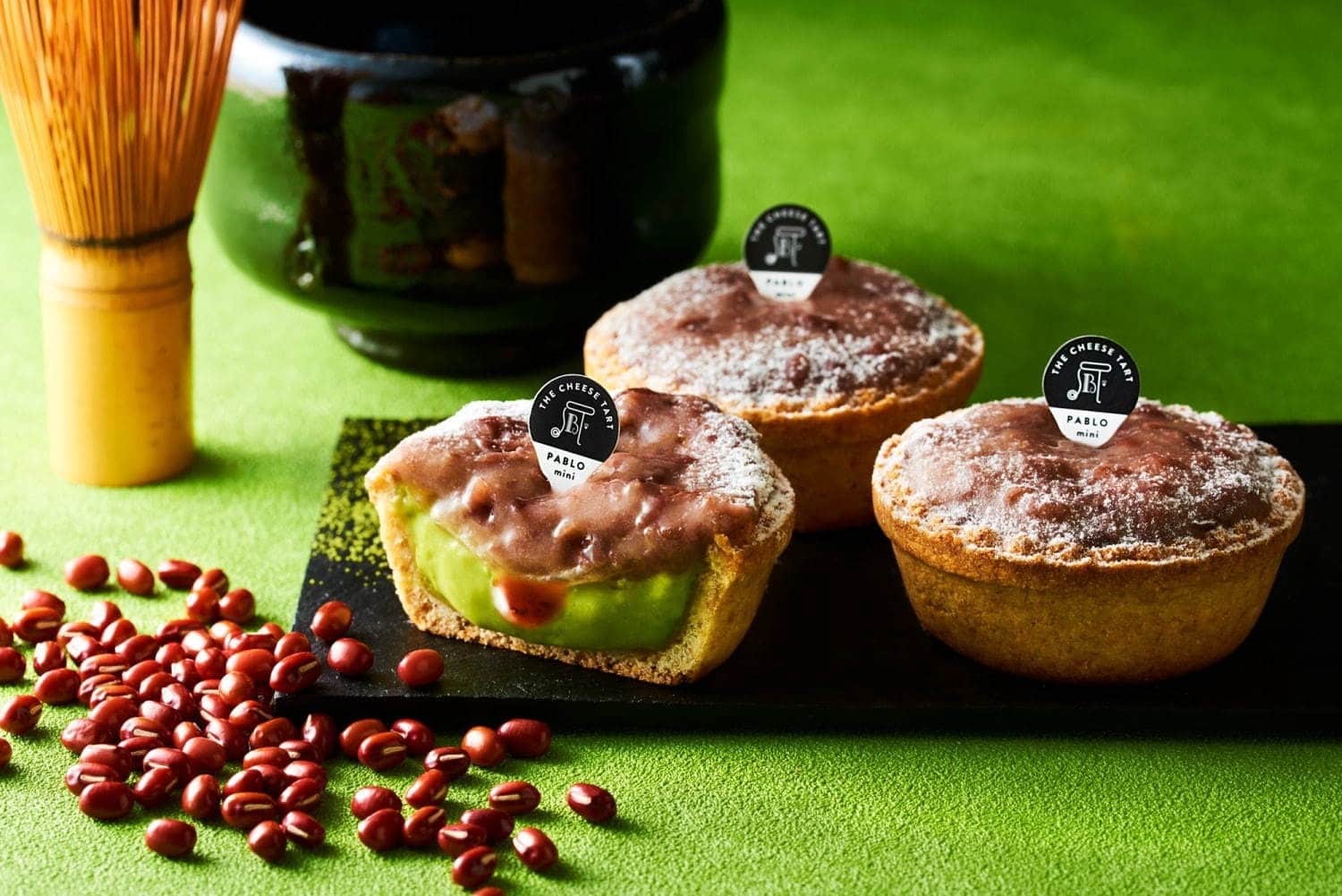
In addition to explaining with text, you can also explain with pictures, such as having a prop on the side as a Japanese teacup, showing the origin of the green tea in this tart, which is Japanese green tea and contains red beans.
3. Colors convey meaning, such as green, which conveys freshness and looks natural, so it should be used in menus that stand out for their freshness and cleanliness. Yellow conveys happiness, so it attracts customers’ attention well. Red stimulates purchases, etc.
4. Choose the highlight menu in the middle of the page because most people look at the middle first before moving their eyes to the top left and top right.
5. Set an attractive price, ending with the number 9, because it makes customers feel that the price is not too expensive (even if it is only 1 baht more).
6. Group similar menu items together to make it easier for customers to compare and decide. For example, there are many flavors of desserts in the shop, but the ones with the same green tea flavor are placed close together, separating the flavors.
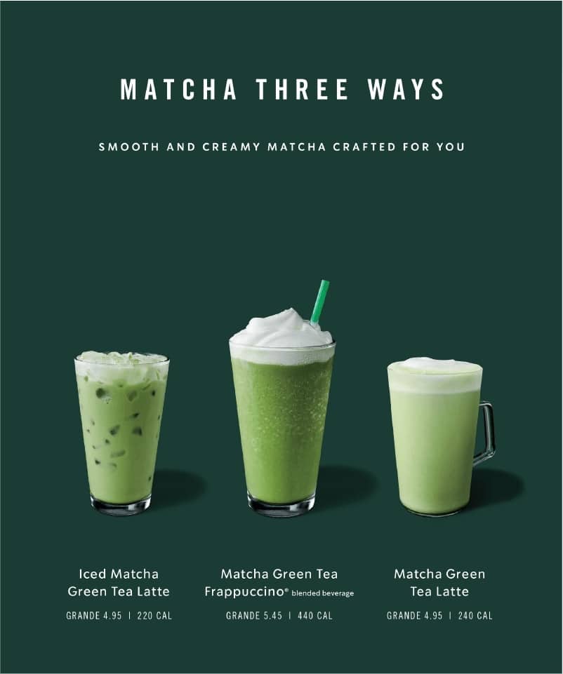
7. Choose to use some graphic symbols to replace words or text for easy understanding and not too much TEXT, such as using the symbols of tea leaves, hot, cold, blended drinks instead of the text that must be specified.
8. After filling in the necessary information, don’t forget to leave some space in the image or menu to make the food in the image stand out, easy on the eyes, easy to read, so that customers can make a decision to buy more easily.
Source
Pinterest.com
https://creative.starbucks.com/voice/
Article from: Fuwafuwa