Logo is an important part that is like the face of the shop. It affects the brand’s recognition, especially in this era where there are many new dessert and drink shops. The logo on the food packaging, the easier it is to remember and unique, the easier it will be for customers to tell others. What are the principles for designing a good logo that is easy to remember and unique to other shops? Let’s take a look.
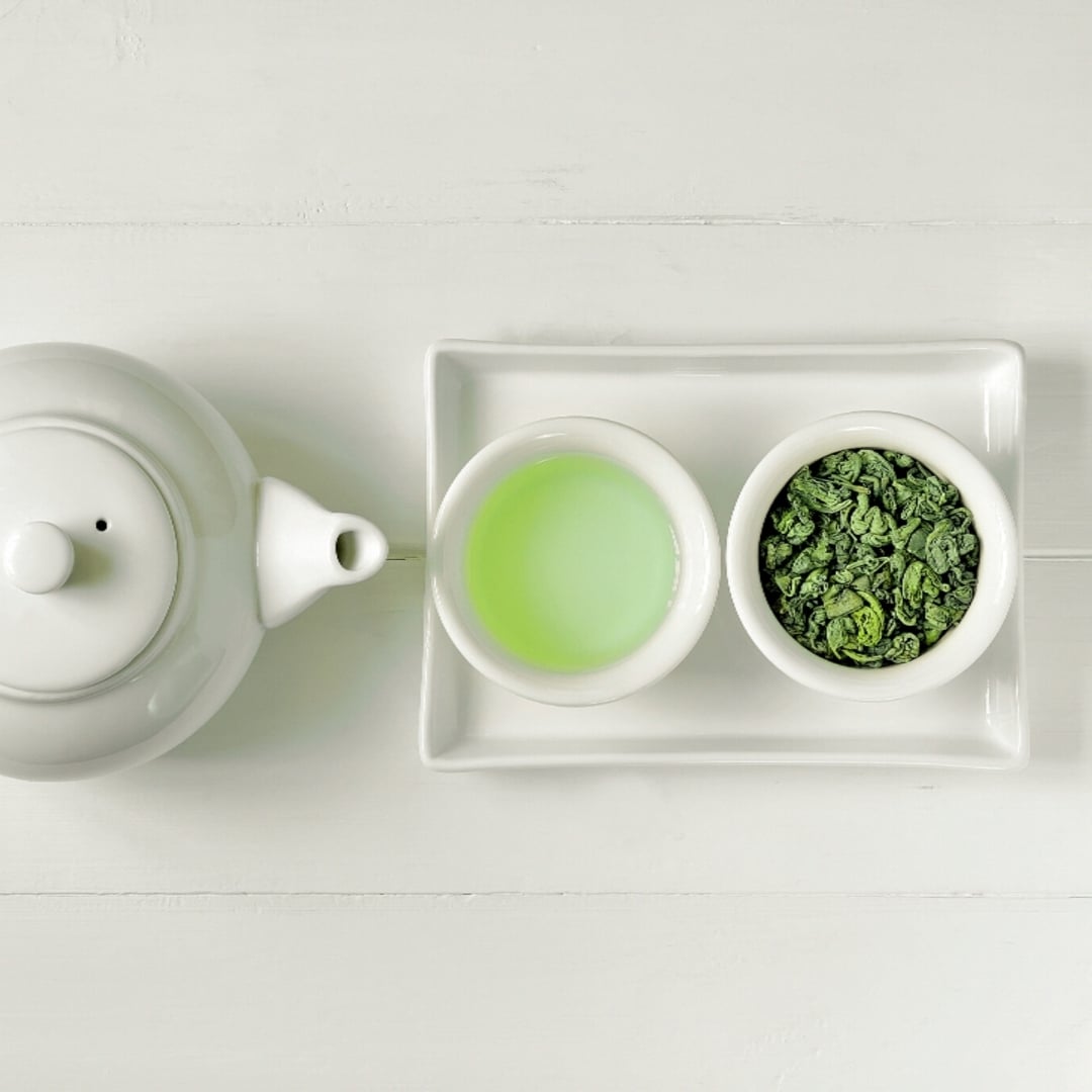
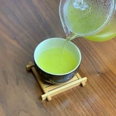
Start with mustHave the shop’s identity because the shop’s logo should communicate the identity of the shop, the style of food sold, and immediately know what kind of restaurant it is. It should have characteristics related to the shop’s name. If it doesn’t overlap with other shops, it’s even better because it prevents confusion among customers. For example, a shop that sells authentic green tea from Japan might use Japanese to communicate the origin of the shop’s star ingredient or use a design that’s like a Japanese intang (rubber stamp) to bring out the unique Japanese design to communicate the origin of the authentic ingredients.
![]()
![]()
![]()
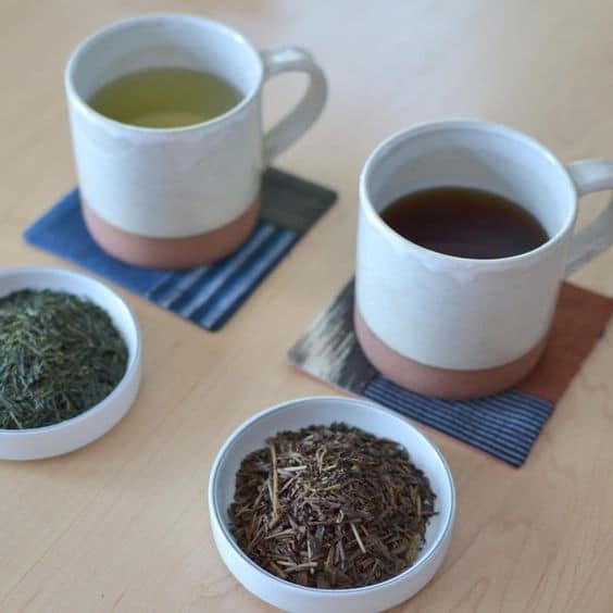
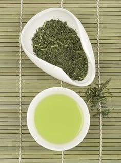
A good logo should convey meaning. Because a good logo must be able to convey more meaning than just stating the name of the shop, such as using images of tea leaves, tea cups, or tea brewing equipment to indicate the shop’s expertise in the taste of tea. The images in the logo should have been thought about to have meaning, be easy to understand and remember, in order to communicate directly to customers. In addition to the images used to convey meaning, the color of the logo is also an important part that helps to easily think of the products in the brand. For example, using green in the logo makes it easier to think of green tea, conveying naturalness, not processed with synthetic substances.
For the logo to convey the mood of the shop , you must first know what kind of mood you want the image to have and how it will be consistent with your shop. For example, a tea shop whose target group is women does not focus on strong tea but focuses on adjusting the recipe to be diverse, making it easier for women to consume and having other snacks made from tea. You will need to use a logo with a pink tone to attract the attention of women who are gentle. Or adjust it to a simple, calm logo but focus on sweet-colored packaging to reach the target group of women.
![]()
![]()
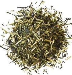
Do not use too many colors. The number of colors used in the logo should be 1-3 colors, which is appropriate and does not cause confusion. In addition, the mood of the colors used is also important, such as green, which conveys nature, health, freshness, and growth. In addition, it also creates a refreshing and relaxing mood.
![]()
![]()
![]()
Don’t forget to check your competitors. Visiting other brands’ websites or social media helps us practice analytical thinking to see if the logo looks good, communicates meaning, and is unique enough to make improvements to the store. It’s an analysis of the brand’s strengths and weaknesses. And don’t forget to always follow design trends, such as using the color of the year, ultraviolet purple, or using gradients and typography to make your logo stand out.
But you will see that there are many types of logos, whether they are simple letters, images, graphics, or mascots. Each type conveys a different meaning and reaches a different group of customers. For example, for brands with cartoon images, this type of logo will help attract children and families. It is also a great way to stimulate interaction with the target group. Or for the use of just certain symbols, such as tea leaves, tea scoops, or chasei, it is enough to convey the meaning that this shop focuses on selling tea.
![]()
If you have already created something but are still not sure whether you should use it, test it on your website or create a profile. Or maybe create a poll to ask people to provide feedback, such as asking if it looks good enough, if there are any changes you want to make, if it matches the website, in case you want to adjust some points to make it easier for customers to remember before actually producing the media.
Have you gotten any ideas yet? For those who are going to try to open their own business, here we start by designing a logo that we like and then extend it to put on the shop’s business card, product package in the same style to make it memorable to customers and make them want to tell others more easily.
![]()
![]()
![]()
Source
https://gdc.jp/archives/category/works/food
https://www.packagingoftheworld.com/2012/07/kotoha-with-yuica.html
https://www.behance.net
Article from: Fuwafuwa