Why do we need to give so much importance to the media and photography of our restaurant’s menu?
Because color is one of the most important parts of design. Because color will determine the feeling and create the mood of the viewer, whether it is a single tone (monochromatic), bright (bright), cool (cool), warm (warm), or adding a variety of shades to perform different functions in one design piece.
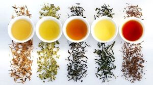
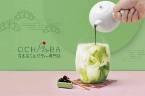
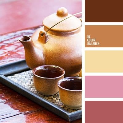
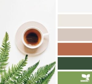
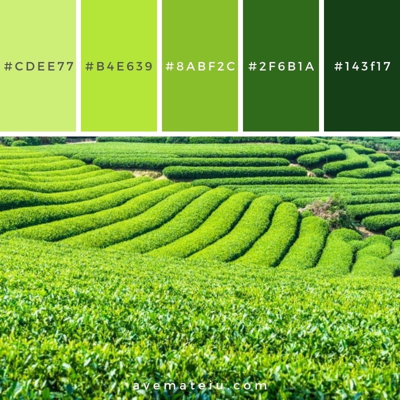
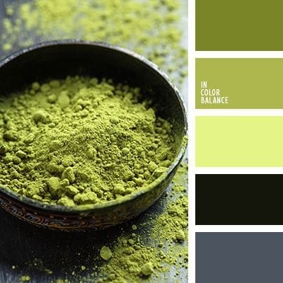
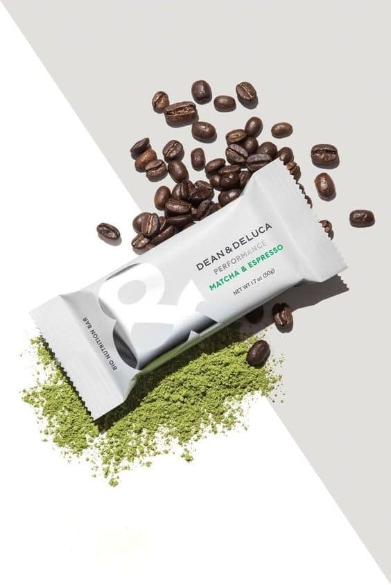
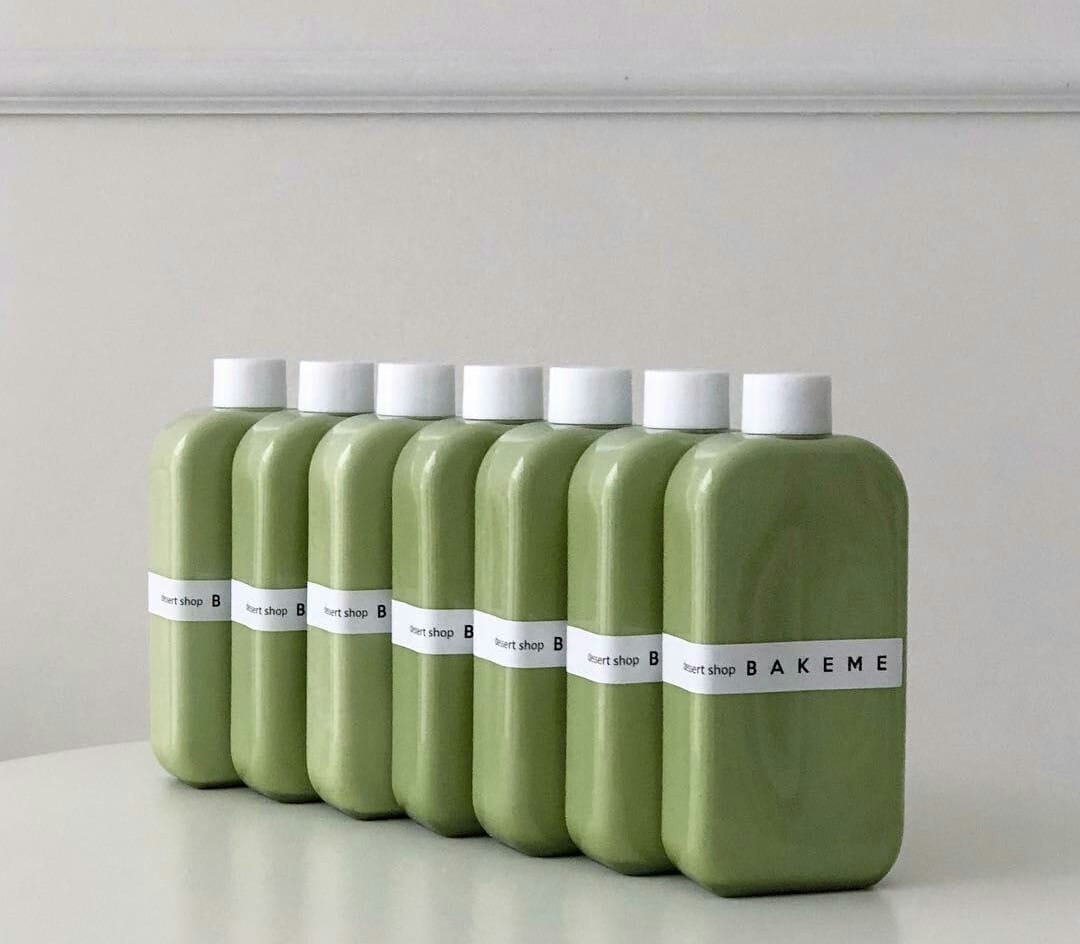
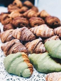
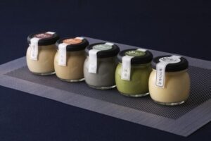
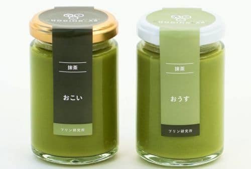
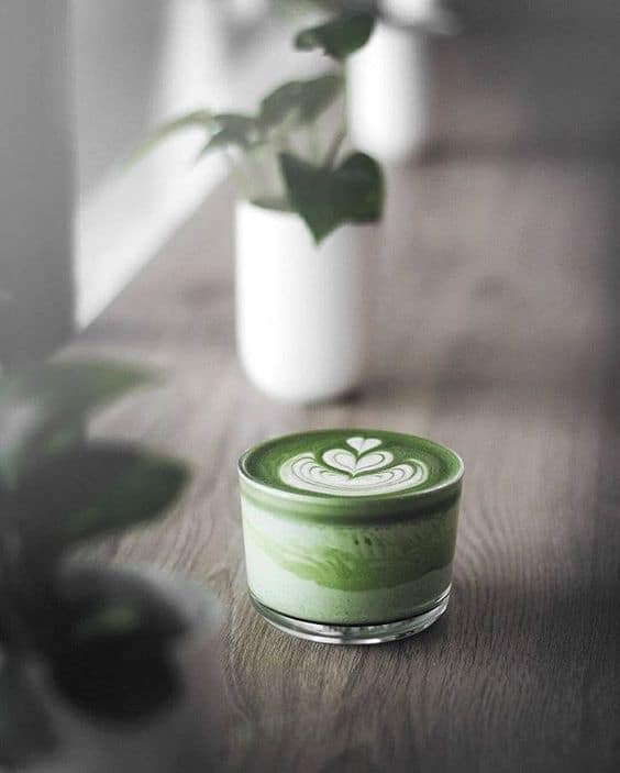
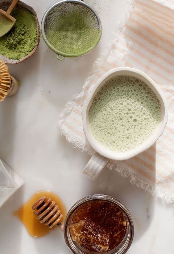
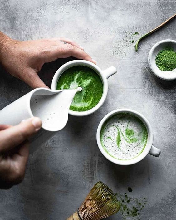
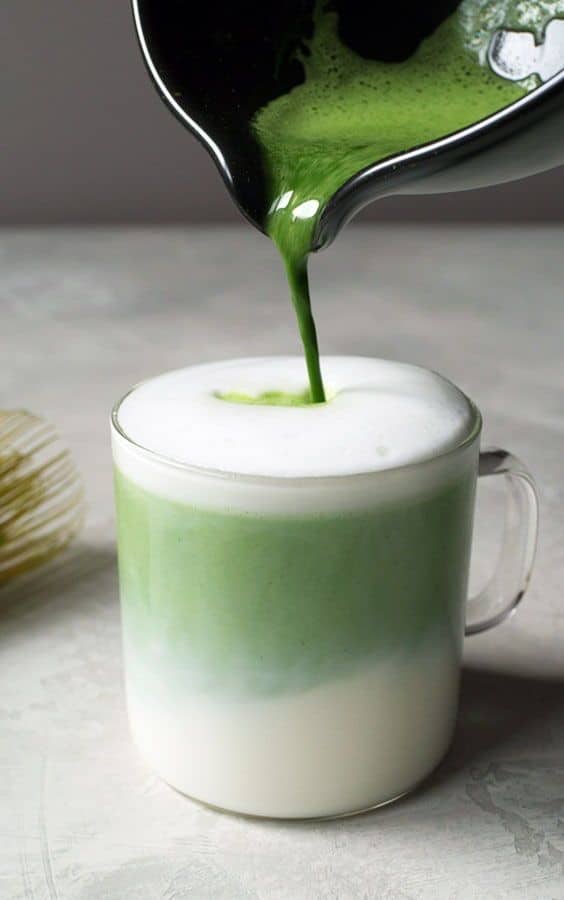
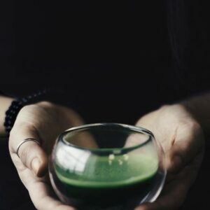
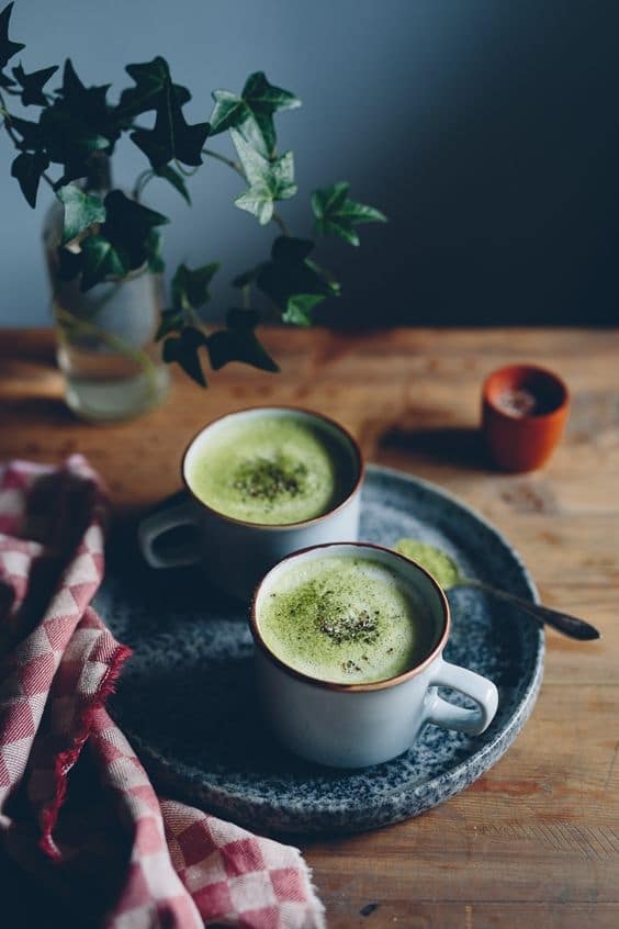
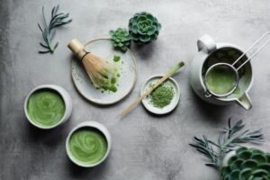
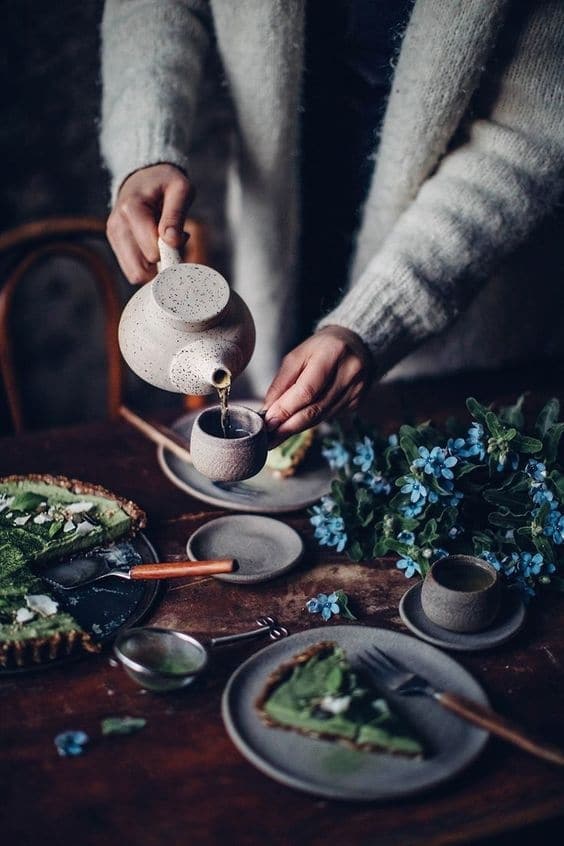
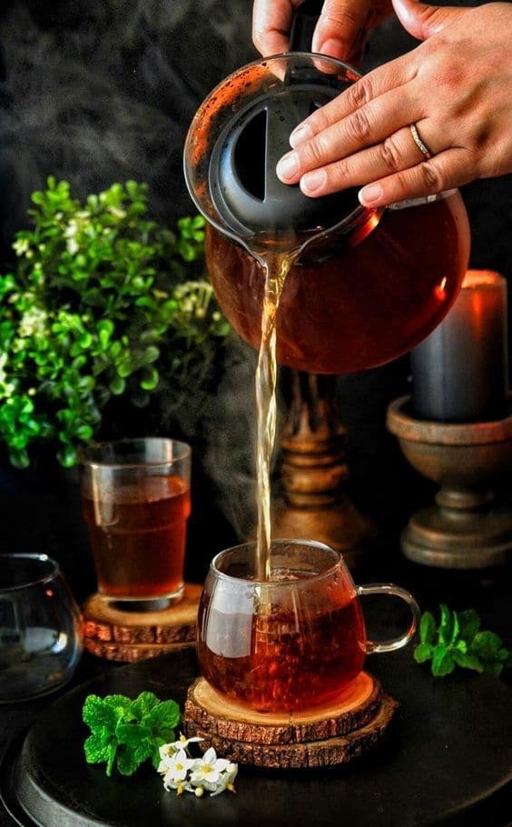
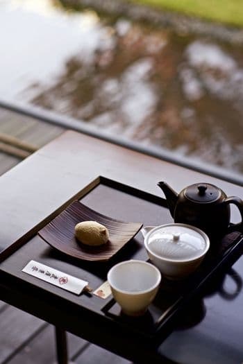
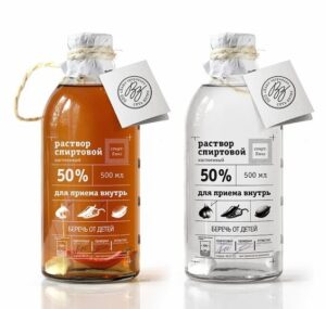
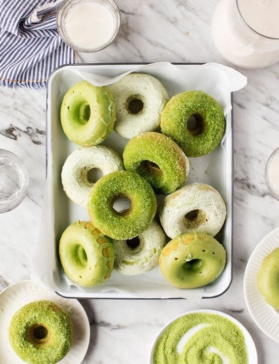
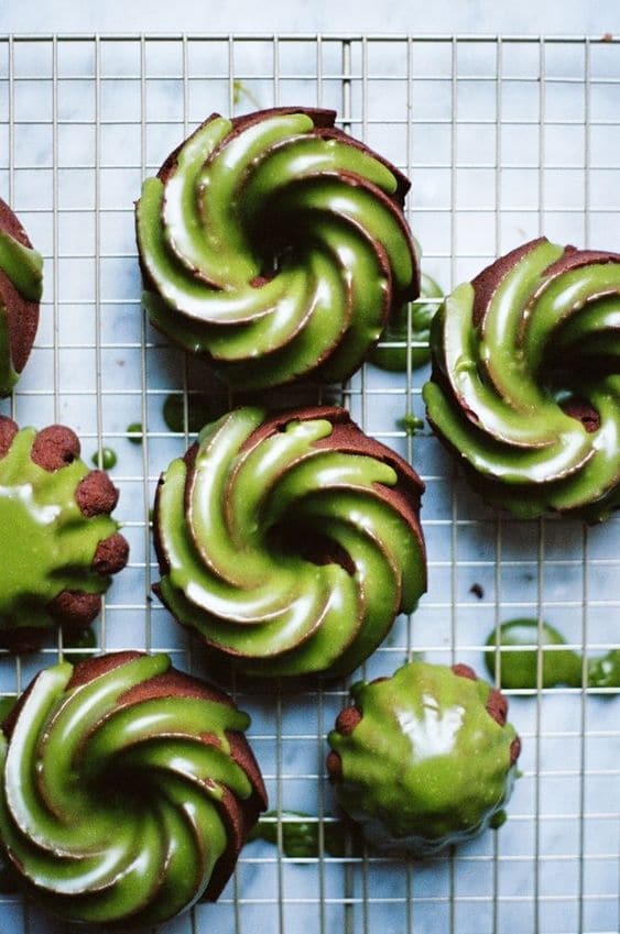
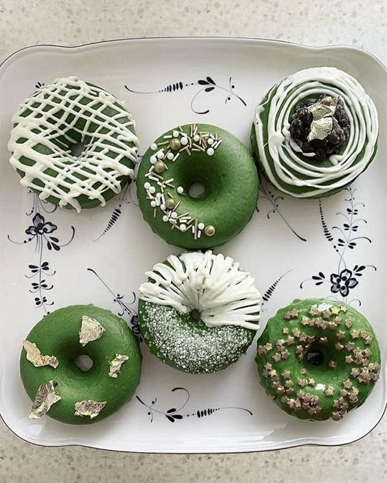
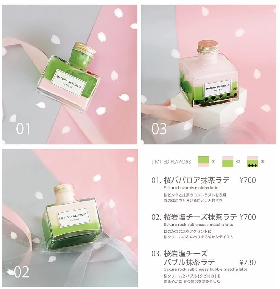
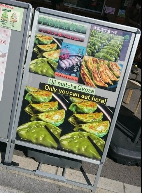
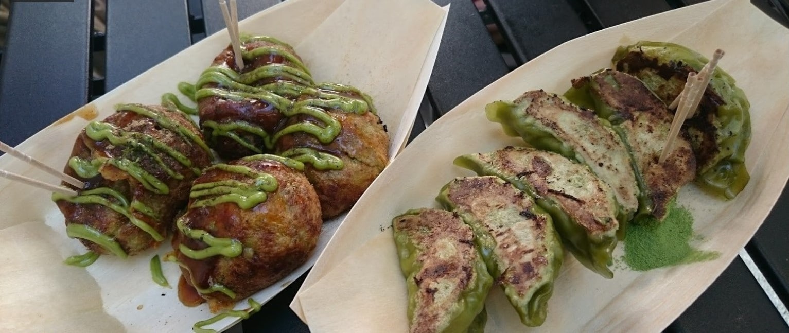
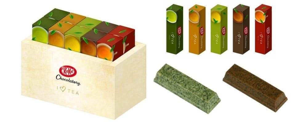
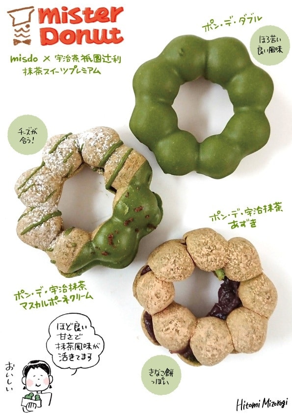
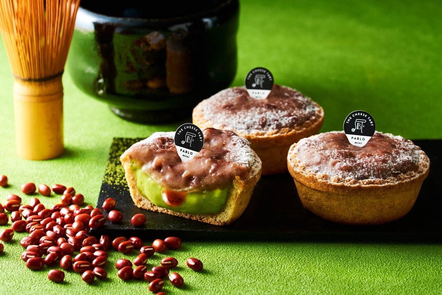
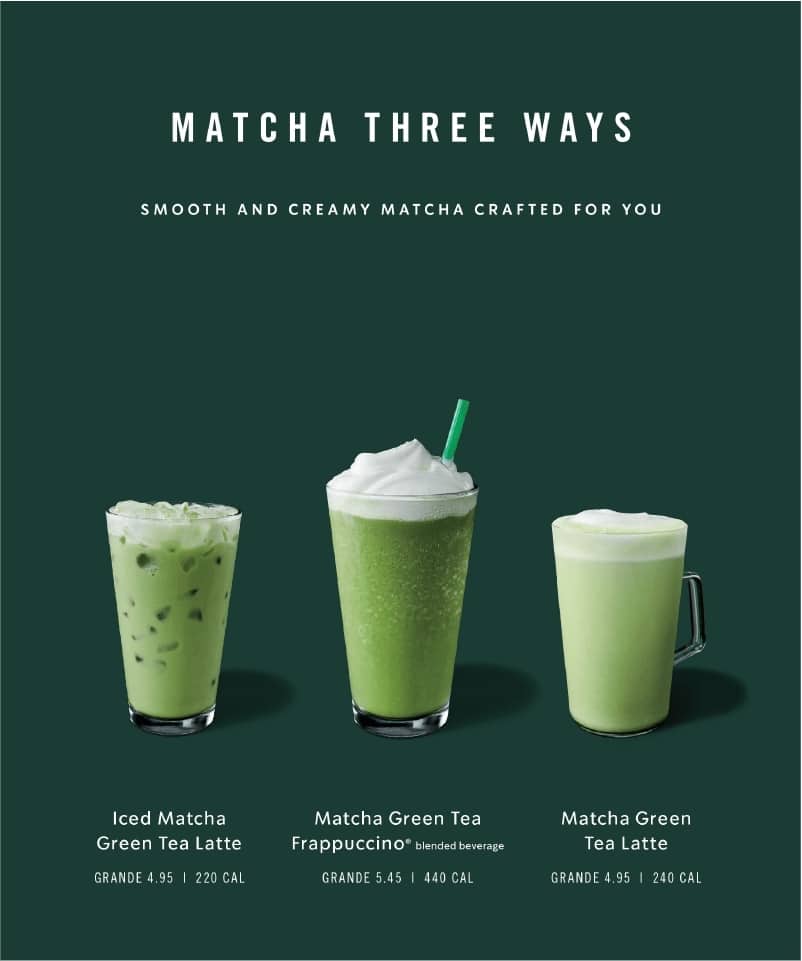
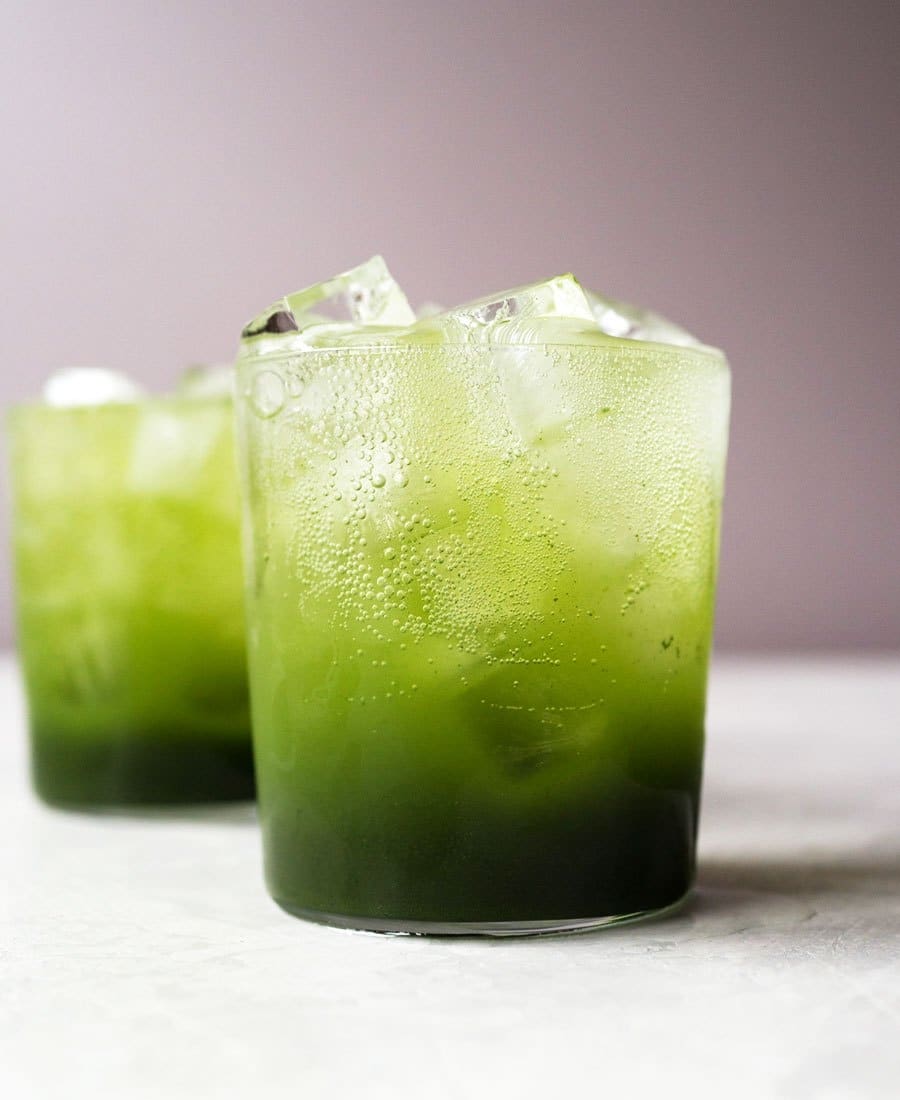
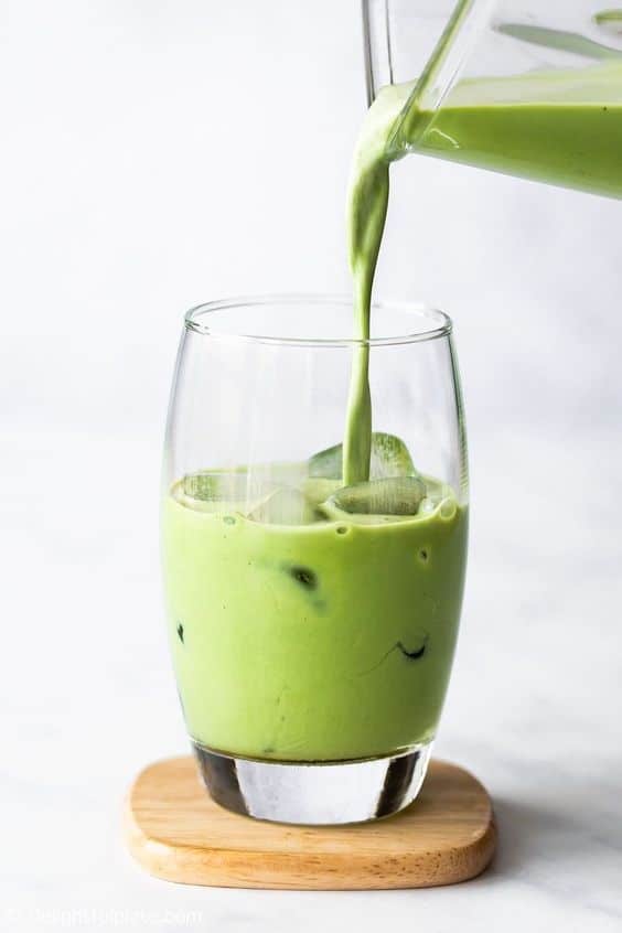
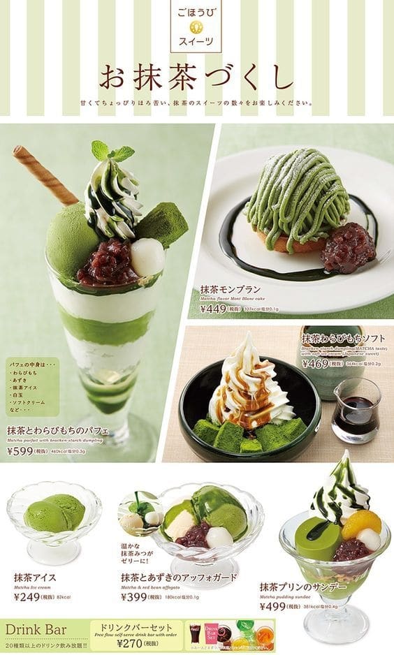
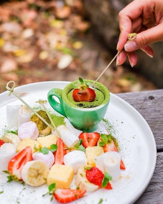
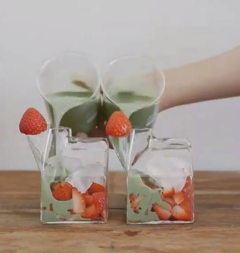
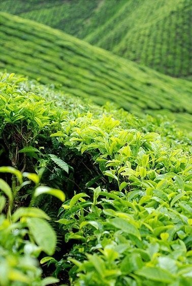
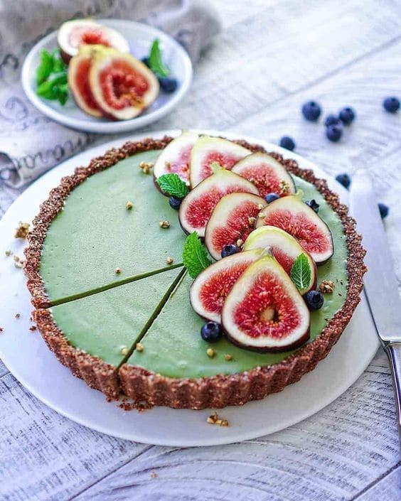
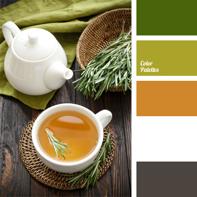
Each type of tea gives different colors depending on the harvesting and production process. The charm of tea colors that are not gaudy and are naturally pleasing to the eye, such as matcha that gives a dark green color, hojicha that gives a reddish-brown color from roasting green tea, or oolong tea that tends to be golden yellow. If these colors are on the poster or package of the shop, highlighting the highlights and choosing the right color pairs, choosing a Pantone color set that helps to enhance the image to look full, will help make the image look pleasing to the eye and more easily attract attention. Importantly, having a color set in mind will help you brief the graphic design work that is designed, whether it is the tea menu or the packaging of the shop, to understand in the same direction more.
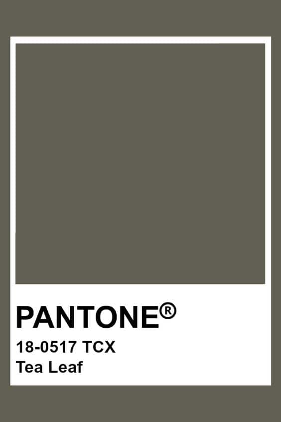
Many people may not know what Pantone means.
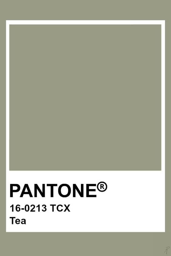
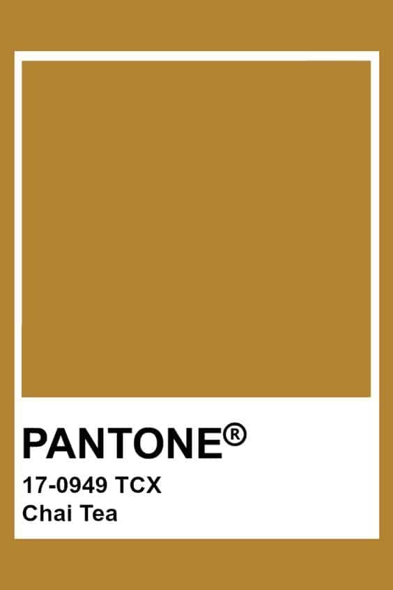
Pantone is the name of an American printing and design company. Many people know them as the creators of the Pantone Matching System (PMS) color matching standard used by printing companies around the world.
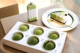
When we print posters, make labels, or find color pairs for media of green tea products, I believe many people have encountered the problem that no matter how we choose, the tea color is still not as desired. Having a set of Pantone colors to compare with your favorite colors will help you get a more accurate job. Because sometimes if we look at printed work on a screen, each screen has different brightness and the color can be easily distorted. This color selection technique can be used to adjust the composition of the image for taking pictures as well.
The first thing to consider when choosing colors is that too many colors can make your design look confusing and not as appealing as it should be. The method most people recommend is to use 2-3 colors in the design. Use the technique of lightening and darkening the colors from those 2-3 colors to make the piece more dimensional. Try using the color wheel to choose. I guarantee that your work will come out looking clean. For empty spaces, try adding a little texture so that it doesn’t come out too smooth. If you’re focusing on selling Hojicha tea menus that have brown tea colors, you should use orange tones together and adjust the intensity of the tea color down.
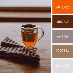
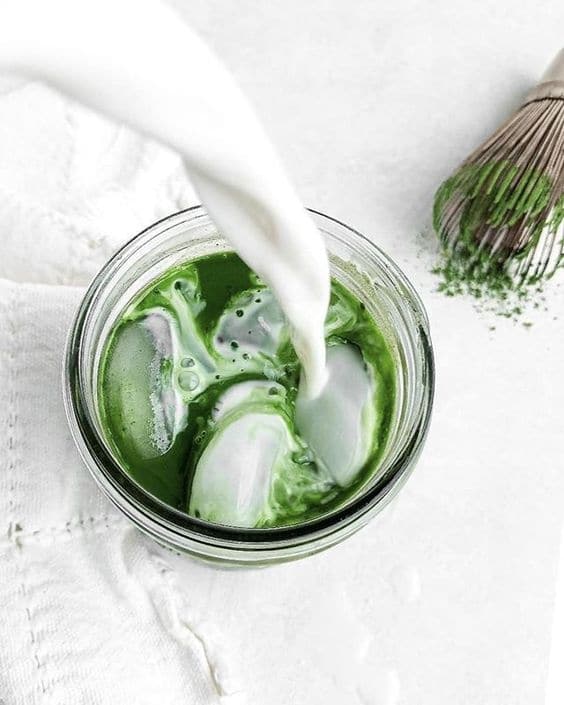
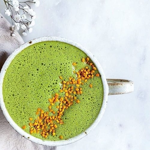
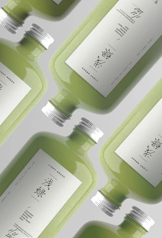
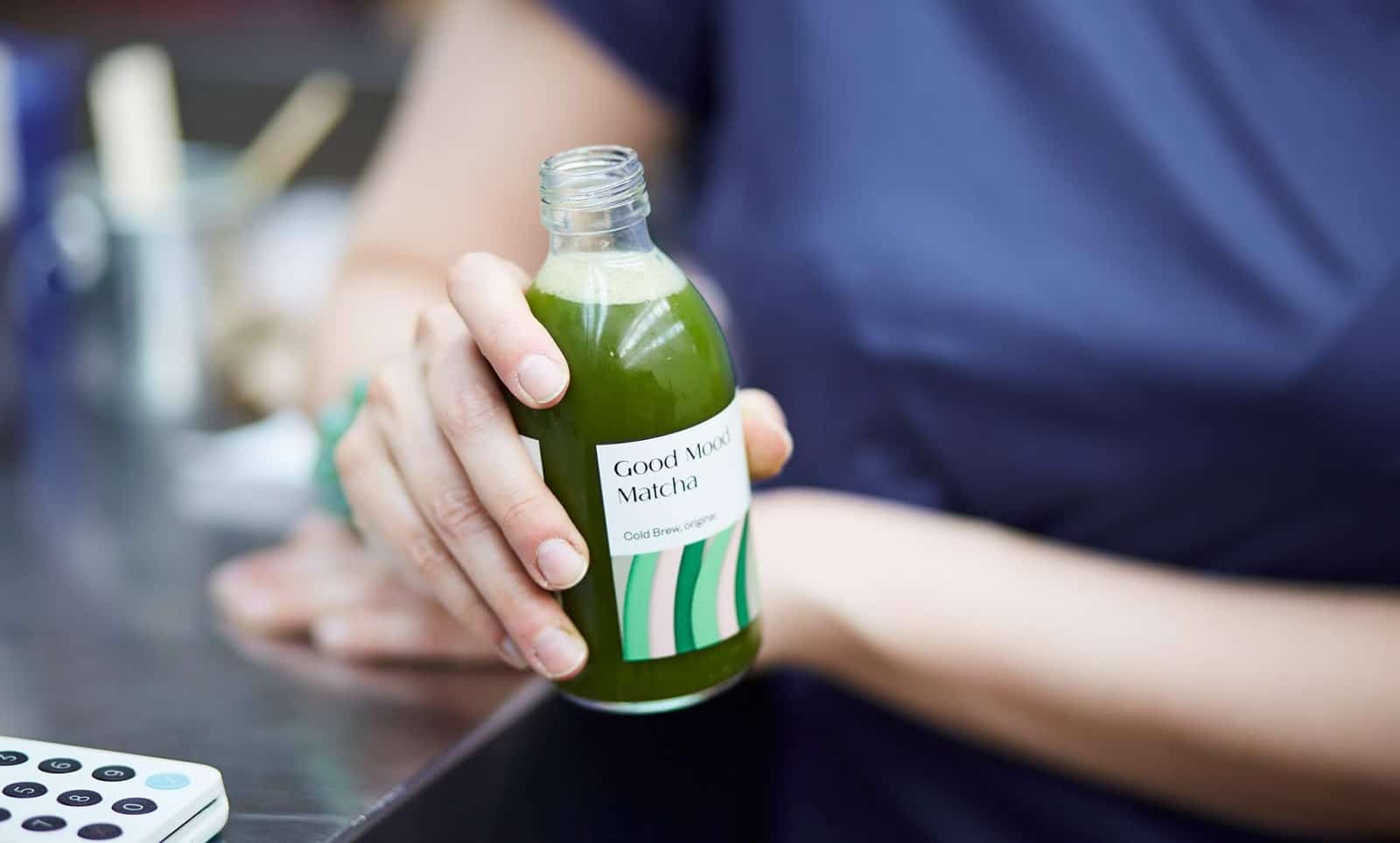
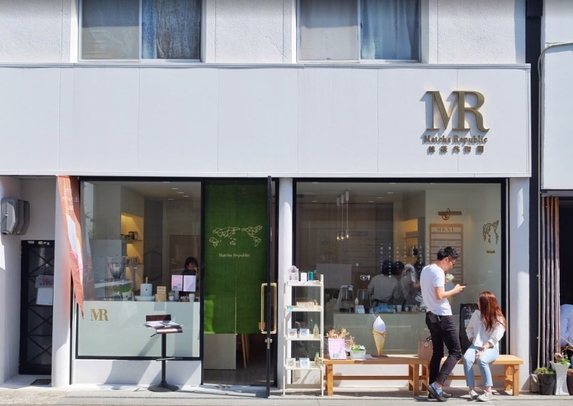
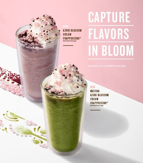
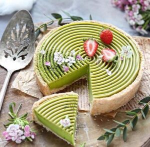
Techniques for choosing the main color and finding the color that goes with it. Think about what kind of work you are designing. Is it sports, fashion, beauty, or business? Because the mood of each work uses different colors. Do you want the mood of the work to come out soft or intense? Then try to add a little more detail. You will get interesting colors. For example, green tea. The main color is green. The color that goes with it is pink. That will make the picture look gentle, easy to access, and friendly to consumers. Or if it is an orange-brown tea color, you can use pink as a pair as well.
Or if anyone really can’t think of anything, try going to Pinterest, a source of many designs that will give you ideas and groups of color tones that have already been paired to use in arranging the composition of product photography images. And on Pinterest, there will be color values displayed, making it easier to use because we don’t have to sit and compare ourselves to what kind of green tea to use. Just type in the color value and we’ll get the exact correct tea color. Or if you’re not sure which color code to use, another method that will help you get the tea color that’s closest to the real thing is to suck the color from an image that has the tea color that we want.
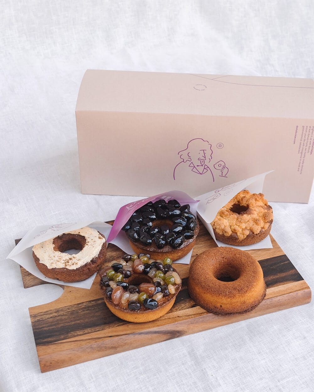
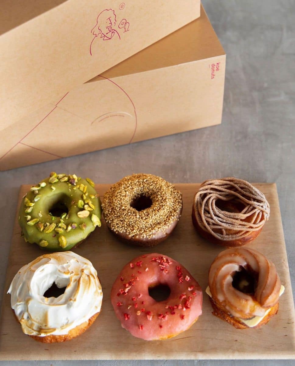
We have therefore collected examples of popular color tones used in artwork to provide green tea lovers with ideas for easier and more convenient use.

Source
https://colorpalettes.net/wp-content/uploads/2014/08/cvetovaya-palitra-478.jpg
http://color.romanuke.com/tsvetovaya-palitra-2164/
Article from: Fuwafuwa


